|
|
|
|
|
|
 |
|
 |
Je suis d'abord et avant tout un concepteur. Ce site est un portfolio de projets en conception graphique, illustration et rédaction. Pour plus d'information ou d'exemples, n'hésitez pas à me contacter. |
|
I am first and foremost a designer. This site is my portfolio, filled with graphic design, illustration and writing projects. For more information or additional samples, don't hesitate to contact me. |
|
|
|
|
|
|
logos  |
 logos |
|
|
|
|
|
|
|
| |
|
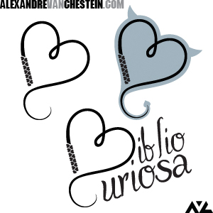
BiblioCuriosa est un wiki répertoriant les oeuvres de littérature érotique française. Afin de bien représenter le site Web, son logo devait donc être artistique tout en faisant allusion à la matière traitée. Le fouet a été choisi comme élément thématique, son trait dessinant un coeur ainsi que les initiales du wiki.
Avec ou sans le texte, le logo se tient bien seul en monochrome. Cependant, la cliente a demandé un second logo avec un peu de couleur; une version alternative qui pourrait être utilisée en favicon ainsi que dans la marge du site. Un contour gris-bleu fut donc ajouté, comportant des cornes de diable et terminant le fouet par une queue pointue. Ceci a donné à ce logo alternatif un petit côté coquin bien apprécié. |
|
|
|
BiblioCuriosa is a wiki devoted to cataloguing French erotic literature. Its logo therefore needed to be artistic, but with a suitable twist to tie it into the wiki's theme. The whip was chosen as this element, twirling itself into both the site's initials as well as the shape of a heart.
While the logo could stand on its own in black and white with or without the text, the client requested a touch of color in an alternate logo for the site's favicon and sidebar. A soft teal shadow was therefore added, giving the logo a pair of devil horns and a pointed tail. This has given the logo's second version a well-received touch of playfulness. |
|
|
|
| |
|
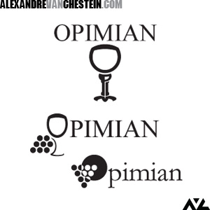
Opimian, une coopérative de commande de vin, a demandé des soumissions de logo afin de revigorer son image classique. Le logo du haut prend le diminutif populaire de Opimian, Opim, et construit une coupe de vin avec ses lettres. Les traits larges donnent une personnalité moderne et solide au logo, le rendant apte à être imprimé sur tout matériel.
Le logo du milieu prend la branche d'une grappe de raisins et en fait le pied d'une coupe de vin, la partie du haut de celle-ci formant le O de Opimian.
Le dernier logo est de conception beaucoup plus géométrique, superposant une grappe triangulaire de raisins devant le soleil. La forme/contre-forme des raisins permet de séparer les raisins rouges des verts. L'exercice s'est révélé très intéressant bien qu'aucuns de mes logos ne furent retenus.
|
|
|
|
Opimian, a wine-ordering cooperative, sent out a call for logo submissions in order to revamp its classical image. The upper logo takes the acronym route, using the letters OPIM (an oft-used shortened version of Opimian) to construct a wine glass. The thick lines made for a modern, strong logo which would be at home on any printed material or seal.
The middle logo went on a more artistic bend, using the stem of a cluster of grapes to make the shape of a wine glass, the upper part itself becoming the O of Opimian.
The bottom logo was a purely geometric design, putting a triangle of grapes up against a circular sun, at the same time separating red grapes from their green counterparts. The process was highly interesting even if none of my logos were ultimately selected. |
|
|
|
| |
|
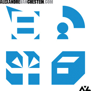
Ces quatre icônes font partie du design du site de mon webcomic Girls on the Road. Ils sont utilisés comme icônes d'un sytème d'exploitation fictif.
Ils représentent bien ce qu'il est possible de faire à très petite échelle: ils ont tous été créées à partir d'une grille vectorielle 6x6. Ils sont tous composés de triangles, carrés et pièces de cercles.
L'icône supérieur gauche (une étiquette) mène à plus d'information sur des personnages et des endroits, le supérieur droit (une tête dans le rôle d'un émetteur) mène aux forums, l'inférieur gauche (un cadeau) mène au matériel téléchargeable et l'inférieur droit (un tiroir de classeur) mène aux archives.
|
|
|
|
These four icons were used in designing the site of my webcomic Girls on the Road. They were meant to be part of a fake operating system, following the site's theme.
These best represent what is possible to do on a very small scale, in this case a 6x6 vector grid. The icons are all constructed from triangles, squares or parts of circles.
The icon in the upper left leads to additional information on characters and locations (symbolizing a description tag), the upper right one is the link to the forums (showing a person's head in the role of an emitter), the lower left icon is for downloads (a gift) and the lower right one leads to the archives (in the form of an open file cabinet drawer). |
|
|
|
| |
|
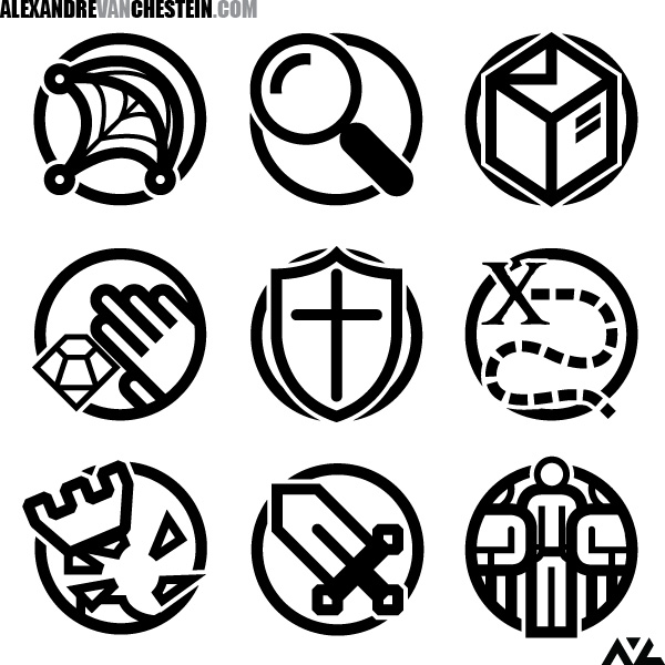
Logos additionnels
|
Additional logo designs |
|
|
|
|